A CASE STUDY: Best Practices for Brand Identity Guides
Who is Matty?
Matty is the key icon, inspiration and lovable mascot for the ChattyMatty® brand. As an inclusive mascot, Matty, portrayed as a friendly panda, is a unisex character that appeals to all. As a cartoon panda, Matty is capable of expressing many emotions. So anywhere Matty can helpfully express these emotions, illustrations and animations can be created for this purpose. Please keep reading to learn how we applied best practices for the ChattyMatty brand identity.
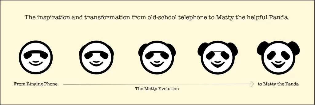
The classic phone inspired Matty’s smiley face. As such, the ChattyMatty app doesn’t feature text communication. Instead, users communicate using voice messages. While roughing out the logo, we began with an old-school ringing phone icon. I saw a panda’s eyes when I noticed an apparent face with a smile. Voila, Matty was conceived!
Many startups and new products have yet to fully develop their brand identity by this stage. In this case, there was the opportunity to design the brand identity and UX systems and name this new product. After workshopping it with the design and development team, we had a most natural and fun name for this voice-based social app, ChattyMatty—combining chats with a unisex mascot that appeals to all.
Next, Matty was developed to become a helpful guide that could demonstrate the app’s functionality through various gestures and props when used as a supporting animation. However, unlike the avatars in the ChattyMatty app, Matty only wears fur. Matty never dresses up in human clothing.
Who is the ChattyMatty® app for?
“Let’s face it, dating apps are often about the looks and hook-ups. ChattyMatty is different. We’ve created a social environment that’s about meeting people based on shared interests. It’s not about the likes, and it’s not about dates. ChattyMatty is designed for meaningful, in-depth interactions and conversations, where users are encouraged to engage in chatter that matters – for whatever reason.
There is no swiping right on ChattyMatty, and we think the right swipe is possibly the worst invention since the Segway, plastic grocery bags and hydrogenated oils. Imagine all the missed extraordinary opportunities and late-night conversations, interactions & lasting friendships because the left swipe forgot to photo-edit their picture with their fabulous fake weekend in Dubai last night or because an app simply doesn’t exist for someone who just wants a new bestie to talk to on the phone for hours.
Users connect based on their sparkling personalities and ability to hold a conversation. Think of the type of connection or friendship that can create. ChattyMatty is a safe environment where exchanging inappropriate pics is not a thing. Read that again. Rare, you say? We think so.
ChattyMatty users can ask another Matty for help to perfect an apple pie recipe or hang out and get chatty with someone who enjoys golf, for example. The point is, if you’re looking for a hook-up, keep on swiping. On the other hand, if you’ve been lonely these past couple of years and are looking to reconnect and re-socialize in a way that’s a little less intimidating than stepping out the front door, you’re in the right place.”
—from the About ChattyMatty page
The screen above is an Adobe XD Mockup that you can interact with. Remember that that not all functionality and interactivity is possible without knowing some keyboard shortcuts. Contact me to learn more.
Matty is prominently featured in buttons in the ChattyMatty app, illustrating what interaction occurs when pressed.
Best practices for Brand Identity Systems and Style Guides.
( and how we applied them to ChattyMatty )
Logos and Application (app) Iconography.
Apps require various sizes of logos depending on the platform—iOS, Android, and Web. So, the Logos, Icons, Buttons and Animations collection for usage with the ChattyMatty brand was designed to be scalable at all possible screen sizes. For example, the ICO above (scaled up) demonstrates the value of considering even the smallest possible representation of Matty the Helpful Panda.
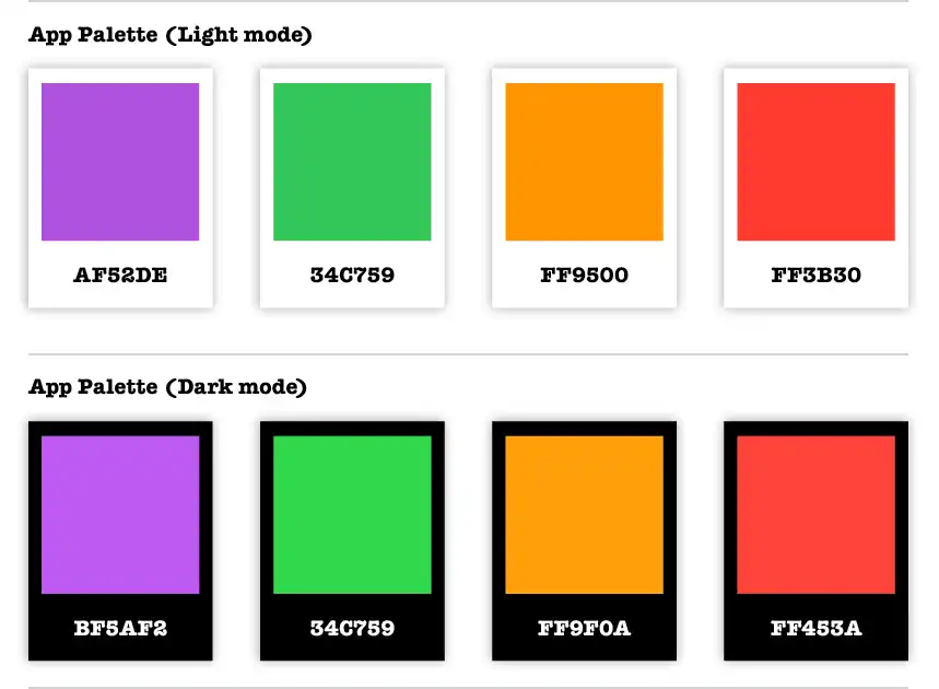
When designing for Print and Digital usage, also consider Light and Dark Screen Modes.
The official ChattyMatty App Palette uses iOS colour guidelines for Light and Dark device modes.
Great care was taken to ensure best practices when applying colours to the ChattyMatty® brand. And since this is a digital-first product, the adoption of Apple’s light and dark colour palette was chosen before developing the brand. This allowed us to choose an optimized purple that looks amazing in both brightness modes.
Define Protective Space & Minimum Sizes for brand graphics.
Protective space guidelines are defined for every logo to ensure sufficient space around them while providing maximum impact.Then, protective space is applied to the artboards in the Adobe Illustrator files based on the correct usage of negative space. Next, Minimum sizes are provided to guide you in sizing a logo at its minimal readable size in given applications.
Stylized artwork and icons based on the personality of Matty, the Helpful Panda, were a must!
We used Matty’s expressive face everywhere. In this case, an icon of Matty’s face is used in the Call, Microphone, and Word Bubble buttons. Matty’s hand is used for the all-important “Talk to the hand!” buttons for Flagging a message and Blocking an offensive person.
These are just some of the best practices for Brand Identity Systems and Style Guides. Let’s connect so we can build your brand identity and graphics standards system for your great brand. If you want to see the complete graphics standards for the ChattyMatty®Brand Identity System, download the PDF.